
Viktor or Vector?
I find it kinda funny and weird my parents named me Viktor... Did they somehow know my (ink) lines would be able to look like vectors. I don’t think they even knew what a vector was back then?!? Some mysteries of the universe we’ll perhaps never know.
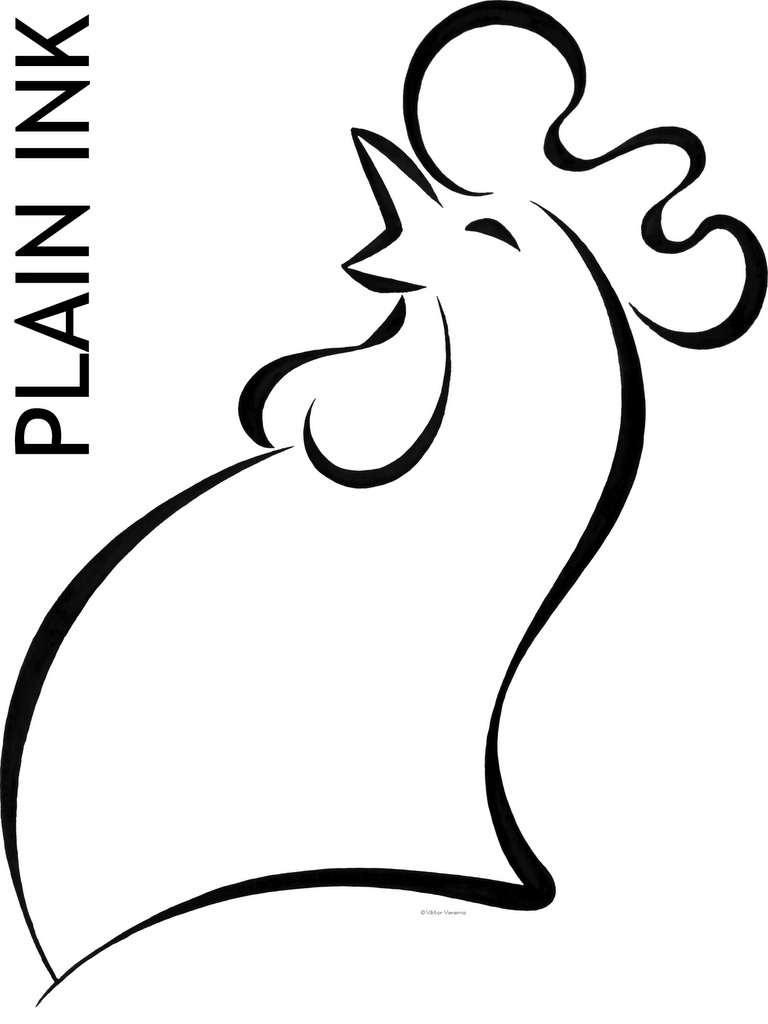
Original ink size was approximately 9x7 cm.

But still... by letting the computer turn my lines into real vectors made it much easier to manipulate them, so that the client could choose which one she liked best.

posted by Viktor Venema at 8:00 a.m.
![]()


2 Comments:
Got the Kellogg's feel and I mean that in a possitive way! Really aesthetic, open logo, I would go for number one (testosteron) or two, a bit more 'suave'. 3 Looks off balance and 4 is neither 1 or 2. But the client's choice is always a gamble. Is there a font involved?
Good stuff Vikt,... I mean Vector!
Yeah! seeing it back did made me think of the Kellogg's logo as well, until I Googled it up.
I too went for number one meself, but the client went for number... 4... a well.
Een reactie posten
<< Home